The Problem
Nobody asked for this. That's the point.
I audited chart implementations across Jira Software, Confluence, and Bitbucket and found the same problems everywhere: inconsistent color usage, no shared visual language, accessibility violations, products that looked disconnected from each other. A survey confirmed what I suspected — 78% of designers spent weeks researching best practices, 65% recreated identical charts in parallel, and 100% flagged accessibility as a concern but didn't know where to start.
The fix wasn't a project. It was a decision to build the infrastructure that was missing — as a side initiative, without being asked.
Impact
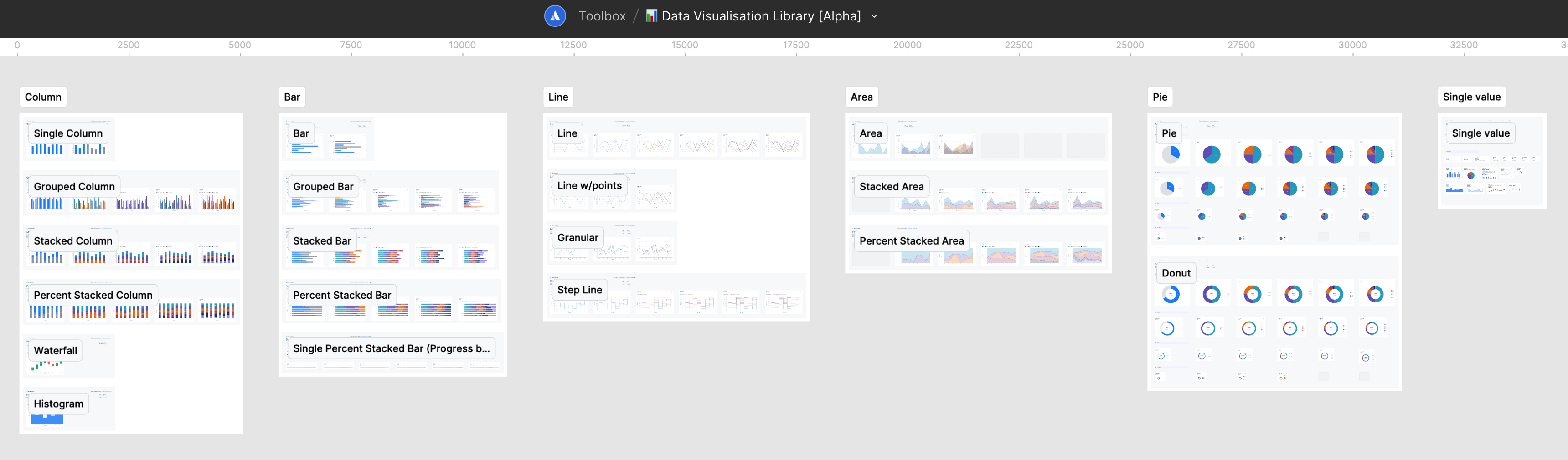
Figma Component Library
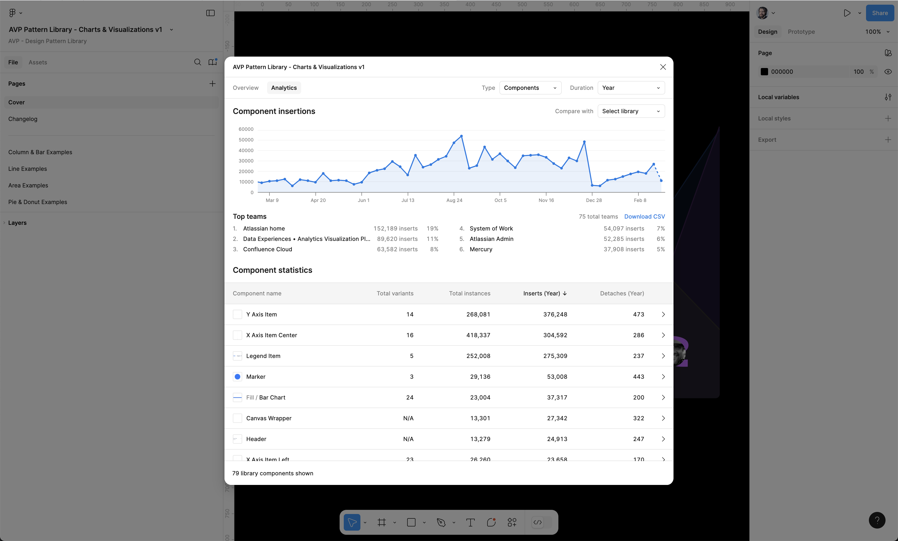
Dual-layer architecture: a Simplified Stickersheet for quick access and an Advanced Toolkit for customization. 45+ chart types, variants, auto-layout, and intentionally "destructible" components so designers learn by deconstructing. Became the most-used Figma library at Atlassian — and more importantly, the shared foundation for how new Atlassian product surfaces visualize data.
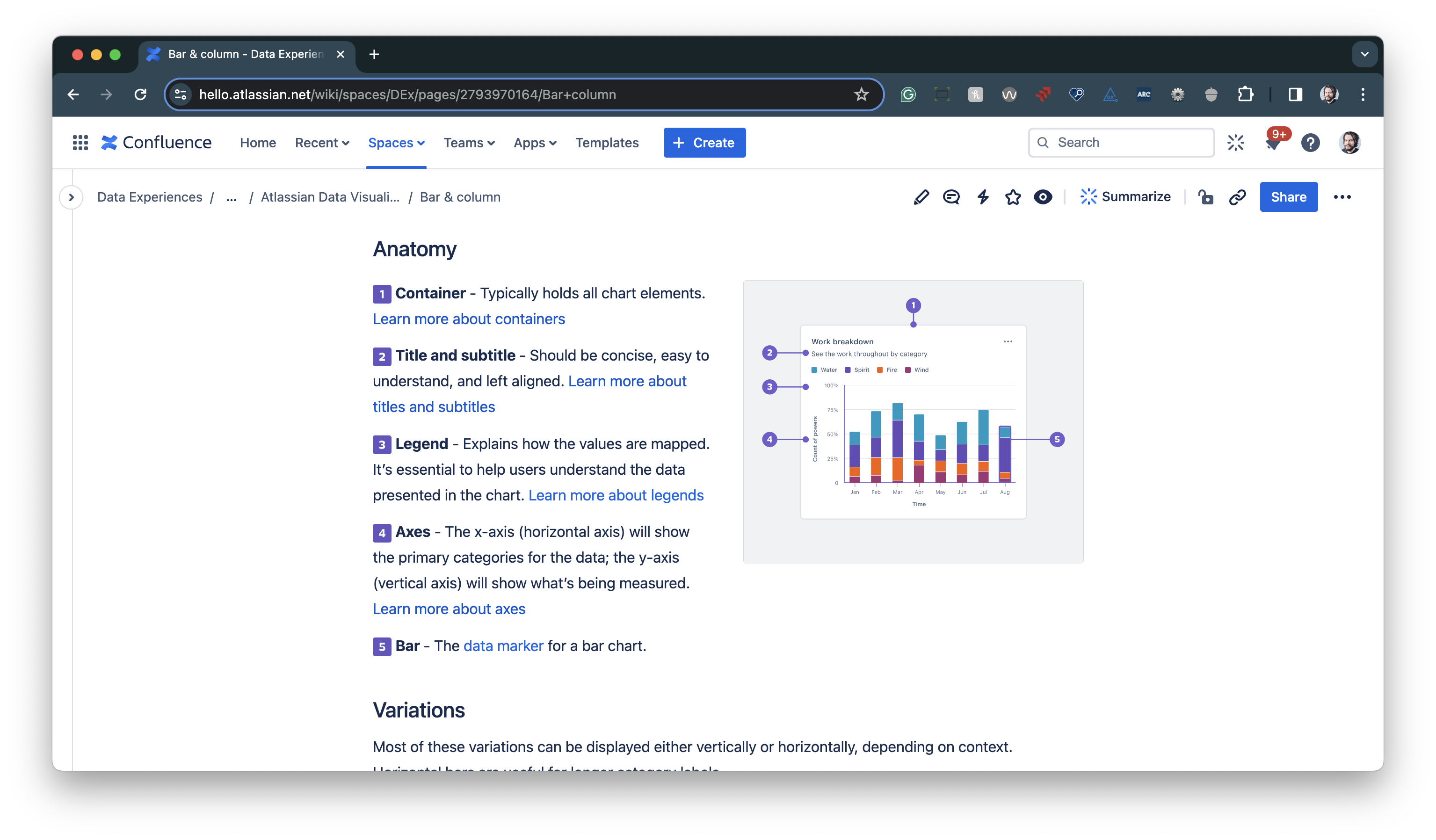
ADS Data Visualization Color System
Authored the official Atlassian Design System data visualization color guidelines — now published on atlassian.design. Categorical scheme using purple, orange, and teal with no implicit hierarchy, sequential and diverging scales, dark mode support, all WCAG AA compliant.
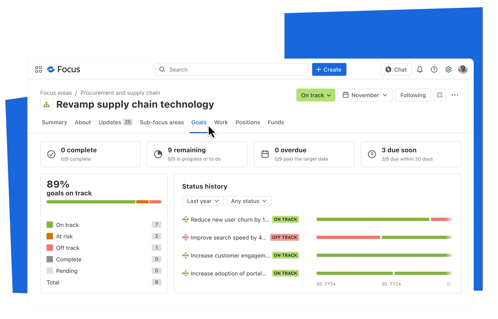
That work moved the impact beyond a Figma library. It established a durable visual language for Atlassian's charts: one that future AI-powered dashboards, customer intelligence surfaces, and executive product demos can build on without reinventing how data should look, feel, and remain accessible.
Explore Atlassian Design System: Data Visualization Guidelines
The official Data Visualization color guidelines I authored — now used across all Atlassian products.
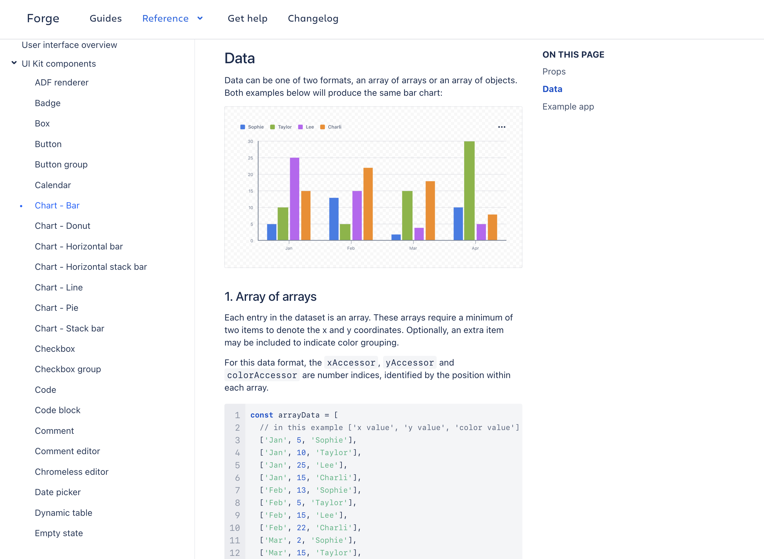
View Atlassian Data Visualization ColorsForge UI Data Visualization Components
Shipped the first official data viz components for Forge — Atlassian's platform for third-party developers. Bar chart, pie chart, accessibility defaults, full API and design documentation. Extended the library's reach beyond Atlassian's internal teams to the entire Forge ecosystem.
Accessible Data Visualizations
Collaborated with Paweł Wodkowski (Accessibility) to design keyboard navigation for all chart types and document screen reader support patterns. The output became the reference for accessible data visualization across Atlassian.
Data Table Guidelines
Authored the shared data table design guidelines now used as the foundation across all GTM surfaces. Shipped the standardizing PR myself — merging code to unify data tables across the Unified 360 products.
How It Spread
Nobody was mandated to adopt it. The library spread entirely through demonstrated value:
Week 1: 3 designers from Jira Software
Week 4: 16 teams requesting access
Month 3: 60+ teams actively using components
Year 1: 120+ teams, 200+ designers
The tipping point came when engineering teams started requesting official code components — a side project had become critical platform infrastructure.
Why It Matters Now
Atlassian's newest AI product vision depends on trustworthy, legible visualizations: summaries, insights, health signals, trend lines, and generated dashboards only work if people can understand the data behind the recommendation.
My contribution was not just making better chart components. It changed the baseline for how Atlassian visualizes information across products. The future-facing AI experiences now have a shared visual foundation to inherit: accessible colors, chart patterns, interaction guidance, and reusable components that make generated insight feel like Atlassian, not a one-off demo.
The power of the Atlassian Platform is that products, data, automation, and AI share one connected foundation. A trustworthy visualization language can therefore travel across Jira, Confluence, service management, and emerging AI experiences instead of being rebuilt product by product.
“The visualization library cut our design time from weeks to days. More importantly, it gave us confidence we were doing things right.”
— Senior Designer, Jira Software
Community & Ongoing Work
Education Infrastructure
Monthly Data Viz Office Hours, quarterly advanced workshops, a 400+ member Slack community for peer support, and contribution guidelines so teams add patterns back into the library. Built for longevity, not just launch.
Design System Sparring (ongoing)
Running biweekly Design System Sparring sessions since late 2025 — reviewing alignment, component gaps, and evolving standards. Still active.
What I'd Do Differently
This taught me that organizational change doesn't need permission — it needs value. By solving real problems for real people, a side project became essential infrastructure.
Three things I'd change: partner with engineering earlier to align on code components in parallel, build a contribution model from day one (retrofitting it later is harder), and instrument usage analytics from the start. These lessons directly shaped how I approached the Data Table Guidelines and Forge UI work — both started with cross-functional alignment before any component design happened.